Integrated Engineering
ecommerce site redesign.
client
Integrated Engineering (iE)
Creator of high-performance aftermarket mods for German-make cars including hardware upgrades and software tunes
handoff date
Dec 2023
Dec 2023
project type
Website Redesign
Website Redesign
status
In Development
In Development
role
Lead Product Designer
Lead Product Designer
rate will be updated once available.
conversion rate
rate will be updated once available.
bounce rate
project summary
client need
iE asked me to design 5 webpages that stood apart from their competitors and appealed to a wider audience.
before the project
- Visual design did not stand apart from competitors
- New users are overwhelmed by dense technical info
- Expert users wanted more in-depth information
what i did
- person_search User Research
- space_dashboard Wireframing
- analytics Competitor Analysis
- web_traffic Prototyping
- family_history Flow Mapping
- lab_panel User Testing
the results of the project
- 5 page templates, in light and dark color schemes, designed for desktop, tablet, and mobile devices
- A unique design that is highly stylistic and cohesive
- Content that is comprehensive enough for expert users without being overwhelming to new users
- Dense, technical content made easy to understand and digest
both users and the client loved the final design:
a new user said:

a new user said:
an experienced user said:
an expert user said:
the product manager said:

Meet Grace.
Meet Grace.
Grace just landed a new job. The salary bump means she gets to treat herself more often. So she did.
She just traded in her old, beat up, 2001 sedan for a brand new Audi A5. And she loooves it.
Then she starts seeing TikTok videos of people taking their highly-customized cars to meetups and she begins learning about the world of aftermarket car mods.
She feels a draw to the community and she likes the idea of customizing her car, but she wonders: Is this safe? Will it ruin my car? What do the mods even do?
The first time Grace searches for aftermarket Audi upgrades, she quickly finds herself lost in walls of dense, technical jargon. Grace feels dumb.
Who is she kidding? She can’t even change her own oil. And here she is thinking she’s the next Dominic Toretto.
Ever dabbled into a new hobby before realizing you’re in way over your head?
This case study is about me trying to fix that.
Part 1
understanding the objective
section summary
- I established the project objectives by asking lots of questions
- I studied the style guide and current site with the Brand Manager
- I analyzed competitor sites with the Product Manager
Before starting any project, I like to ask lots of questions:
- What numeric goal is most important? (Such as bounce rate or conversion rate)
- What abstract goal is most important? (Such as improving visual design or info hierarchy)
- How are we going to measure our progress?
- What needs to change the most? What shouldn’t change?
- What are your brand’s key differentiators? What do you want to focus on?
The list of questions I ask is a lot longer, but you get the point. These help me identify the stakeholders’ main objectives and understand any project limitations. I then like to invert the future-based objectives into present problem statements:
Visual design doesn’t stand apart from competitors
The client’s website and competitor websites featured similar styles and used walls of difficult-to-digest text to educate users about their offerings.
New users are overwhelmed by dense technical info
The product manager asked me to prioritize content for new users. The goal was to educate users, clearly explain offerings, and build trust.
Expert users want more in-depth information
While adding content for new users, it was important not to alienate current users and to include additional advanced information for them.
How do we simultaneously stylize the design to be unique simplify the journey for new users and deepen the content for experts?
Defining the design direction
Visual design goals are a bit more abstract and difficult to communicate through text. To understand the design direction, I studied the iE style guide with the Brand Manager, focusing on areas where the current site fell short stylistically.
Next, the Product Manager and I broke down a dozen competitor websites and a few other sites used as inspiration in a competitive analysis. We discussed the conversion strategies being employed and noted any strengths and weaknesses.
Competitive Analyisis (simplified)
iE website

Notes:
- Header not overly bulky
- No movement
- Similar to competitors
Competitor 1

Notes:
- Sales banner is useful
- Too much info in hero
- Search placement weird
Competitor 2

Notes:
- Vehicle selection is easy
- Brand info above fold
- Header is vertically huge
Inspiration 1

Notes:
- Page is easy to digest
- User actions are clear
- Client prefers slider hero
iE website
Notes:
- Header not overly bulky
- No movement
- Similar to competitors
Competitor 1
Notes:
- Sales banner is useful
- Too much info in hero
- Search placement weird
Competitor 2
Notes:
- Vehicle selection is easy
- Brand info above fold
- Header is vertically huge
Inspiration 1
Notes:
- Page is easy to digest
- User actions are clear
- Client prefers slider hero
Part 2
doing the research
section summary
- I created 3 user personas
- For each persona, I created a user story, empathy map, and user journey
- I planned out each section of the pages to be designed
Integrated Engineering has three target audiences:
newcomers
New car owners with no experience in mods
enthusiasts
Enthusiastic hobbyist with some experience
experts
Community leader with extensive experience
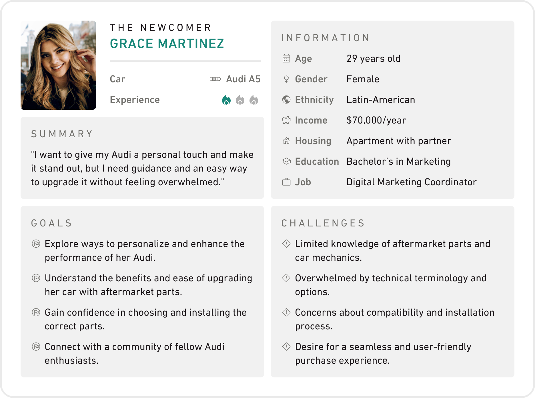
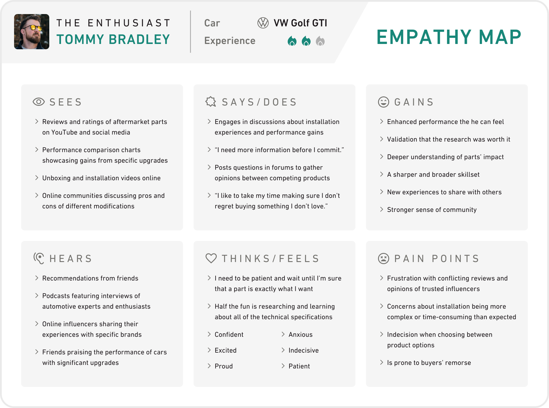
I worked with the Product Manager to gather existing analytic and survey data and to survey additional users. Using this data, I created three user personas, each with a user story, empathy map, and user journey.
User Persona (newcomer)
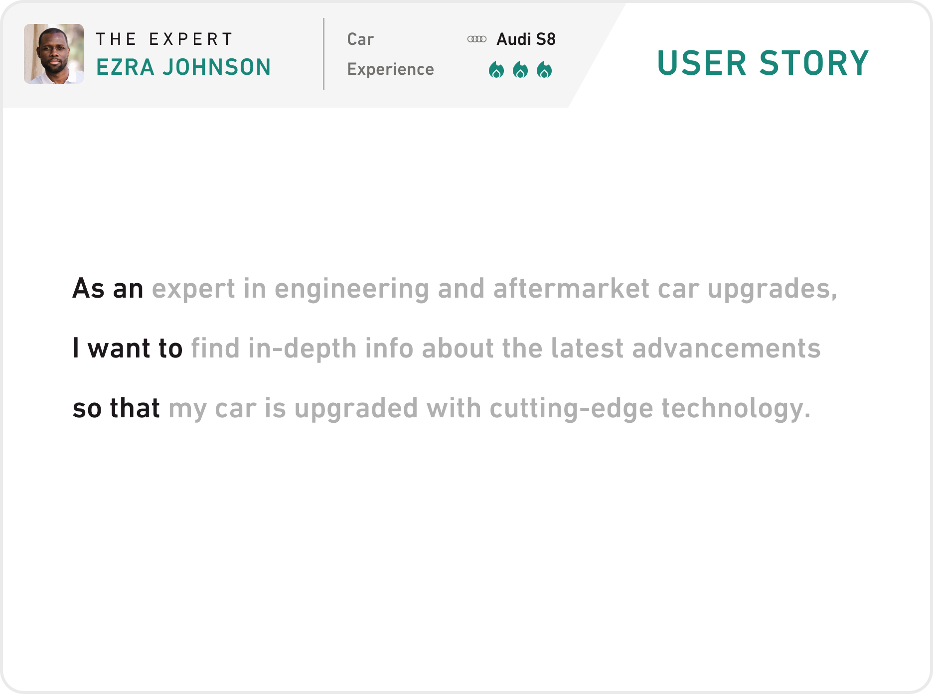
User Story (expert)
Empathy Map (enthusiast)
User Journey (newcomer)
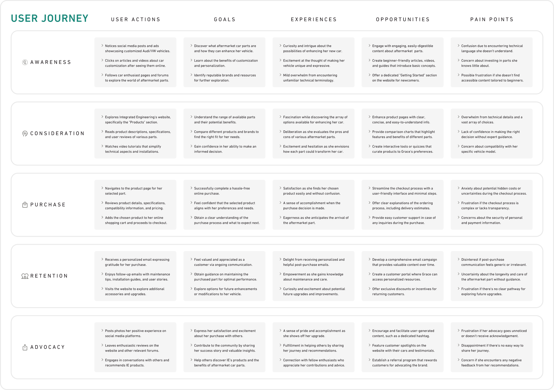
The journey details the user’s actions, goals, experiences, opportunities to connect with the user, and pain points through each stage of a sells funnel (awareness, consideration, purchase, retention, and advocacy).
Although the data provided some good starting points, we still needed to make some generalized (but educated) guesses to create our personas. They will need to be adjusted as we learn more from future user tests.
Retrospective lesson learned:
The user research I compiled was helpful, but next time I would prioritize simple, easily used data over complex, comprehensive data. The sheer volume of text in my user research made day-to-day use tedious.
Part 3
the design process
section summary
- I made outlines of each page’s content
- Wireframes helped me draft the layout
- I dialed-in the design with basic testing
first step, ideate
I like to ideate the same way I like to cook. First, I get out all of the ingredients. I check the fridge and pantry for any extra flavors I want to add. Then I prepare each ingredient and measure it out, all before I light the stove.
The French culinary phrase for this practice is mise en place. I use a similar practice to get a high-level overview of a new design and see how all the pieces will fit together. Below is an example of how I do that:
Page Outline (hardware product page)
Referring to the project objectives and each persona’s needs, what are the ingredients for this page?
content
- Hero/Add to Cart
- Product Highlights
- Product Features
- Kit Contents
- How It Works
- Upgrade Paths
- Before/After
- Review Highlights
- Beginner’s Guide
- Similar Products
- Fitment Guide
- Support/FAQ
- Performance Highlights
- Tests/Results
- Engineering Story
- Installation Guide
- Related Articles
- User Reviews
- User Discussion
functions
- Image Viewer
- Options Form
- Add to Cart Button
- Compatibility Check
- Manual Downloads
- Leave a Review
- Ask a Question
Each ingredient should cater to which persona most?
the newcomer
- Hero/Add to Cart
- Product Highlights
- How It Works
- Before/After
- Review Highlights
- Beginner’s Guide
- Fitment Guide
- Support/FAQ
- Installation Guide
the enthusiast
- Product Features
- Kit Contents
- Upgrade Paths
- Similar Products
- Perf. Highlights
- User Reviews
the expert
- Tests/Results
- Engineering Story
- Related Articles
- User Discussion
How should the content be organized for clear navigation?
product details
Default content view
Grouped to display everything that doesn’t belong in other groupings
- Hero/Add to Cart
- Product Highlights
- Product Highlights
- Product Features
- Kit Contents
- How It Works
- Upgrade Paths
- Before/After
- Review Highlights
- Beginner's Guide
- Similar Products
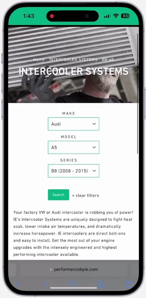
compatibility
Product compatibility guide
Grouped to be easy-to-find
- Hero/Add to Cart
- Fitment Guide
- Support/FAQ
performance
In-depth performance specs
Grouped to not overwhelm users that are not ready for it
- Hero/Add to Cart
- Perf. Highlights
- Tests/Results
- Engineering Story
- Support/FAQ
installation
Installation information and downloads
Grouped to be easy to find (considering it’s mostly used post-purchase)
- Hero/Add to Cart
- Installation Guide
- Support/FAQ
reviews/community
User-generated content and articles
Grouped to be easy to find
- Hero/Add to Cart
- Related Articles
- User Reviews
- User Discussion
defining limitations
Before doing any design work, I like to identify the limitations that will define it. I frequently refer back to these limits to make sure I’m on the right path. Here are a few from this project:
- Spaciousness over compactness. Space gives a feeling of luxury.
- Minimize the amount of content on every screen. Makes for easier mental processing.
- Promote a lifestyle over a product. Paint a clear sequential path for users to follow to achieve it.
- Simplify copy for newcomers without restricting info from experts.
- Accommodate autopilot. Avoid content that requires user actions to function.
Some creative philosophy:
A hobby of mine is to write
little limericks and poems alike
all the meteres and rhymes
may restrict you at times
but the limits of art give it life.
Limits define art. They give music its rhythm, paintings their style, and stories their magic.
We don’t wonder about girls who safely traveled to grandma’s cottage. We wonder about the girls who made it despite a big bad wolf.
Instead of obstacles, limits are puzzles to be solved. Instead of boundaries that restrict, they are pathways that guide.
low-fidelity wireframing
With minor tweaks, the stakeholders approved my page outlines, ushering the project onto the wireframe stage.
This wireframe is an early draft which allowed me to try out a lot layouts and iterate on them with stakeholders.
Ideally, we’d also have users test the wireframes, but resources (time and user availability) made that difficult.
A little confession:
I often get eager to skip to prototyping when it’s time to wireframe. I’m still working on slowing down at this stage, and I know it always saves me time and effort in the long run.
dialing in the design
I was given a lot of creative license for the visual design of this project, so I started prototyping by creating a lot of side-by-side design comparisons. I’d share these with users and stakeholders to help dial-in a design direction.
Color Modes
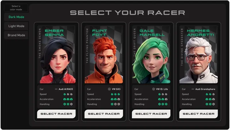
I intentionally throw in surprises (like this video-game-inspired design) to see how stakeholders react and to gauge the limits of the design. The icon-based stats ended up making their way into the final design this way.
creating the prototype
Most iterations of my prototypes get erased with ctrl-z the second I think of a better solution—I have a bad habit of keeping my workspace a little too clean. Below are some examples of design iterations that survived my frequent purges.
Flow Report Iterations
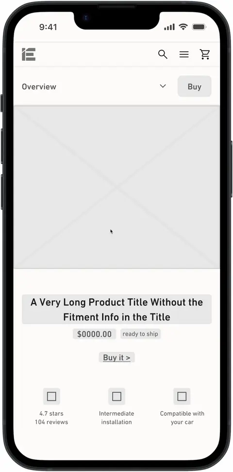
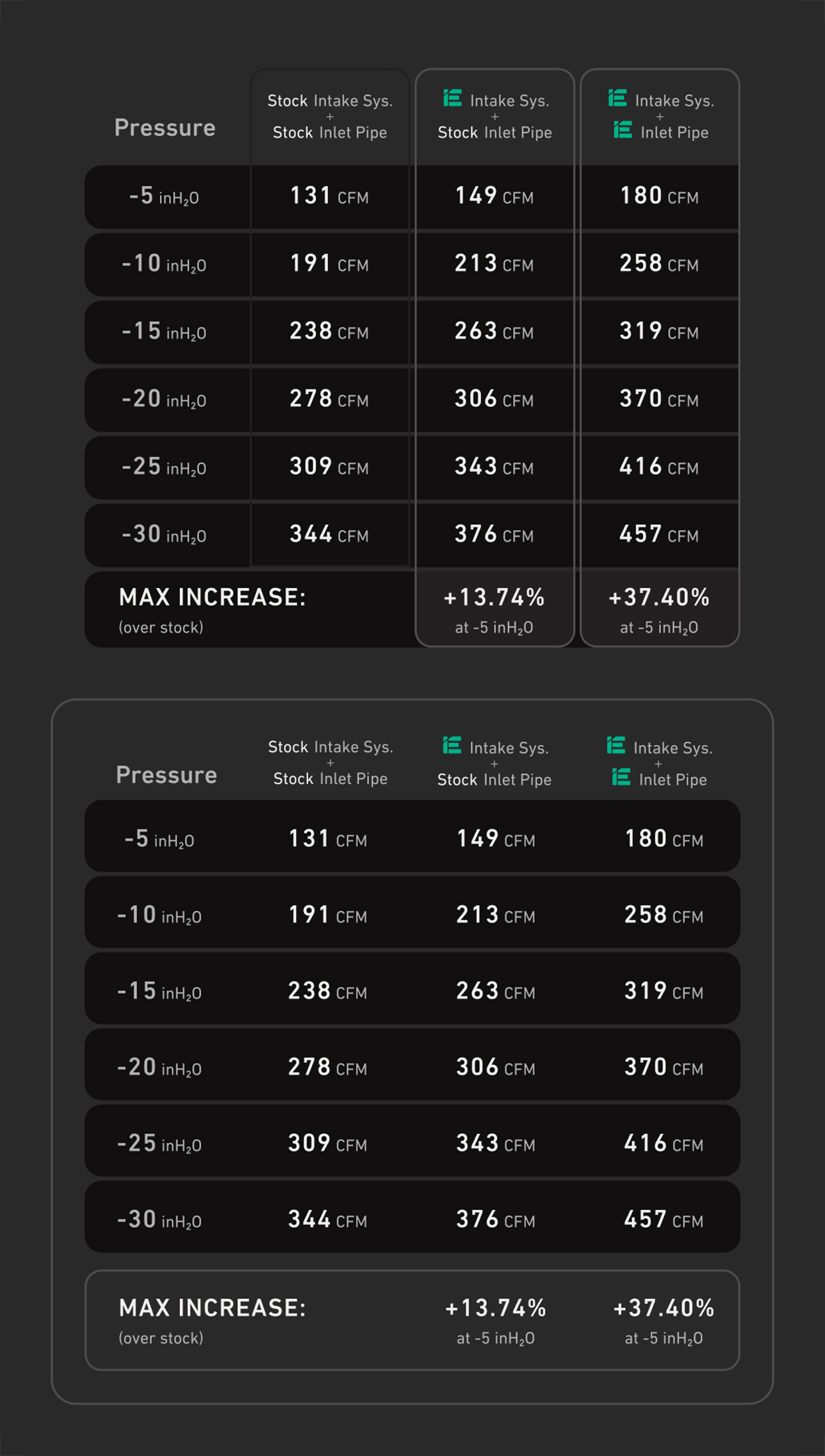
This section went through more iterations than most. It comes from the performance tab for a product page and is full of dense information. Here is the design before the project:
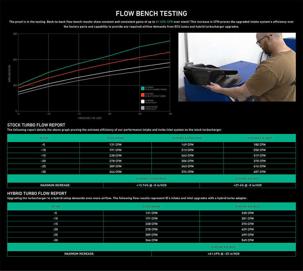
On the first prototype I created, I rearranged the layout, added some tips explaining the metrics used, and restyled the section. I sent it to my Product Manager and she asked for some alternatives for the charts:
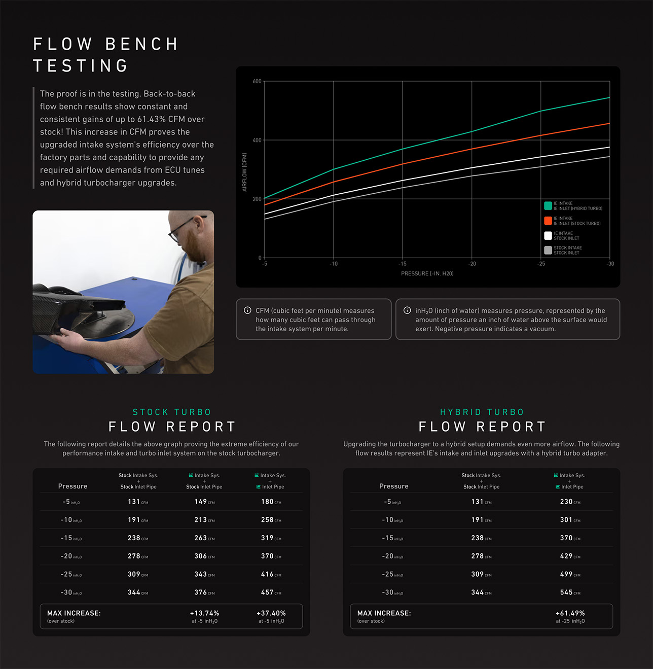
I sent her these alternative designs but even though she agreed to the top one, I wasn’t satisfied.
It felt like I was just shifting pieces around without understanding the “why” behind this section.
I spent a little bit more time to understand what I was designing. Basically, the stock vehicle’s performance is being contrasted with 3 other vehicle configurations that use Integrated Engineering’s products:
- Stock engine with stock intake system
- Stock engine with iE intake system
- Stock engine, iE intake system, and iE inlet pipe
- Turbocharged engine, iE intake system, and iE inlet pipe
Each configuration’s performance numbers are shown in the graph and charts with the max performance increases highlighted at the bottom of the charts. For some reason, the turbocharged engine has its own chart.
Now that I understood the pieces, I realized a lot of the information could be combined. I also used color coding to easily show the correlation between the configurations and their data points:
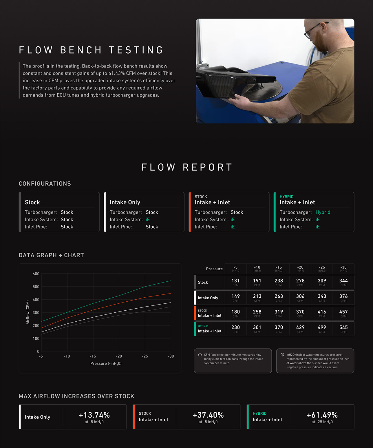
The design lesson: understand to master
In cooking, knowing how to follow the steps of a recipe is usually enough. Knowing why you are doing each step is a-whole-nother level of mastery. The same thing applies to designing things.
User Review Iterations
This early version of a review has gaps between sections and the secondary ratings on the left include: icons, labels, numeric scores, a meter depicting each score, and labels for the meter.
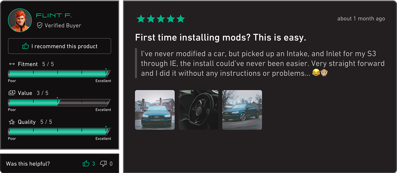
The meters are fun but add a lot of complexity. When you put multiple reviews of this design on the same page, it is visually overstimulating. Also, the left sidebar inflates the height of every review quite a bit.
I ended up using a simpler design that has a shorter minimum height and is easier to digest at a glance:
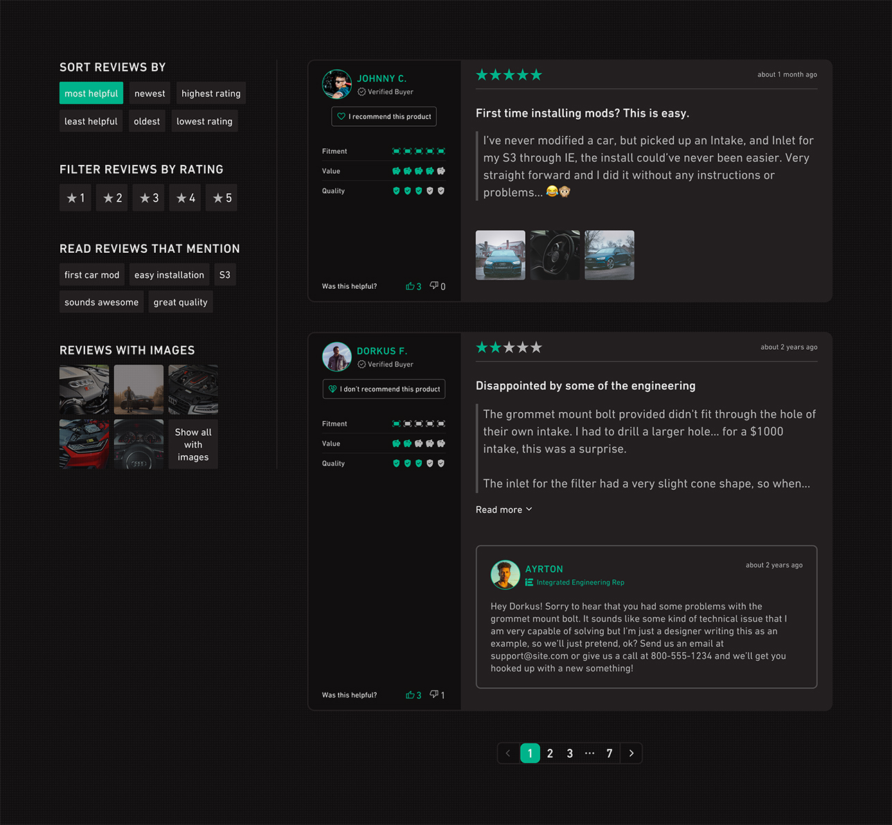
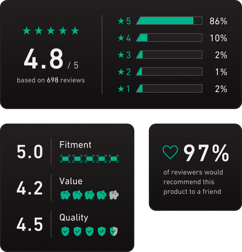
I ended up reusing the idea of the meters (although much simpler) when I designed the review summary/averages section:
The design lesson: keep it simple, sweetie!
I know the phrase is actually “keep it simple, stupid” but I’m trying to avoid any negative self-talk here. Anyways—a good way to test for simplicity is to duplicate an element and look at multiple all at once.
iE Circuit Iterations
This section on the homepage is a fun way to attract new users and help them feel comfortable finding their way around the website.
version 1
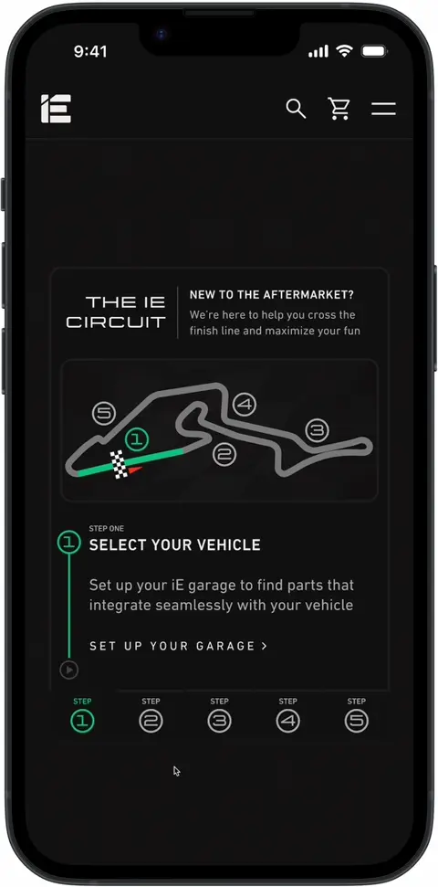
handoff version
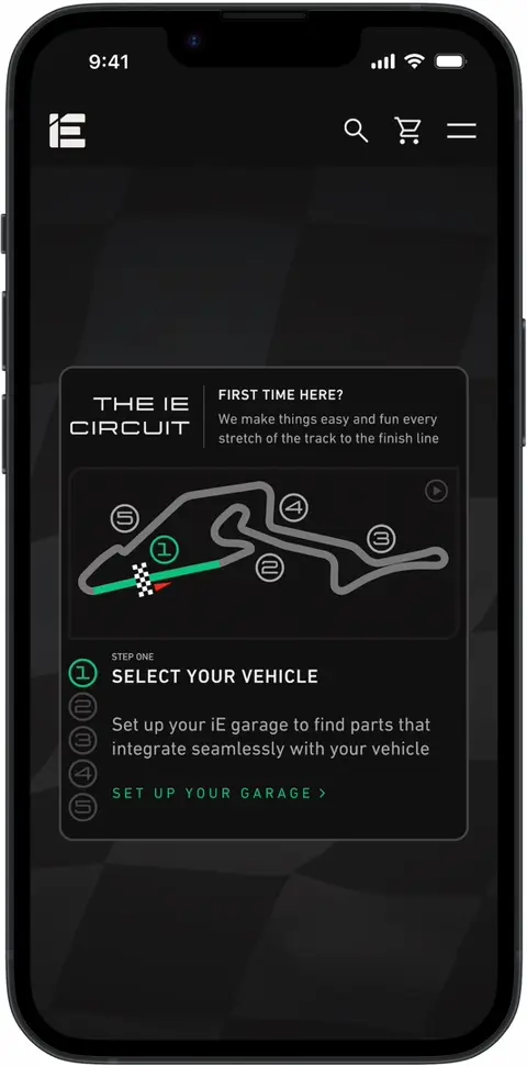
Here are some problems with the initial design:
- Card blends into the background
- Track starts off going right-to-left which is more difficult for English speakers to digest
- It’s not overly clear how the tabs on the bottom relate to the other content
- The call-to-action is smack in the middle of a bunch of animations
- No clear way to pause the animation
- The lines from the number to the car create unnecessary visual complexity
Here are the changes I made to address the problems:
- Card border color lightened and section background changed to create better contrast
- Track is flipped and is easier to follow
- Tabs on bottom removed; numbers added to the left of the text they affect
- Call-to-action is highlighted with accent color and easily found at bottom of card
- Pause button added to the card
- Content is better organized and easier to digest while still capturing attention
I’m curious to see how this section performs. I usually advocate against anything this complex but I’m optimistic that the quirkiness of it will delight users enough to outperform the simplicity of an alternative design.
Not a lesson but a confession: Easter eggs
I like to hide little Easter eggs in my work from time to time. This is modeled after a famous German racetrack, the Nürburgring GP-Strecke, as a nod to the fact that iE specializes in German cars.
Part 4
the long-awaited results
section summary
- Users and client loved the design
- Homepage and product pages available for your perusal
Okay. Let's restart.
Meet Grace.
Meet Grace.
Grace just landed a new job and traded in her old car for a new Audi A5. She gets curious about upgrades.
She looks online and ends up on iE’s website. It looks high-end, sleek, and feature-packed, like her car.
She scrolls down and finds lots of info to help beginners like her. The product pages take their time to explain everything. They’re kinda fun to read.
Before long, she’s ordered her first part, installed it, and even showed it off at a local car meetup. She’s eased into a new hobby and found a community full of friends along the way.
This ending has been the guiding goal of this project. Let’s take a look at the results:
homepage
mobile
View on Figma keyboard_arrow_right
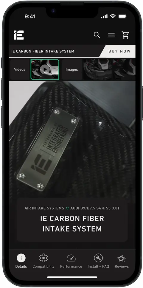
product page
mobile
View on Figma keyboard_arrow_right
homepage
desktop
View on Figma keyboard_arrow_right
product page
desktop
View on Figma keyboard_arrow_right
both users and the client loved the final design:
a new user said:
a new user said:
an experienced user said:
an expert user said:
the product manager said:
rate will be updated once available
conversion rate
rate will be updated once available
bounce rate