BodyGuardz
product replacement interface.
client
BodyGuardz
Creator of premium device protection products including screen protectors, cases, and more.
handoff date
January 2023
January 2023
project type
Interface (0.1 - 1)
Interface (0.1 - 1)
status
Shipped
Shipped
role
Senior UX Designer
Senior UX Designer
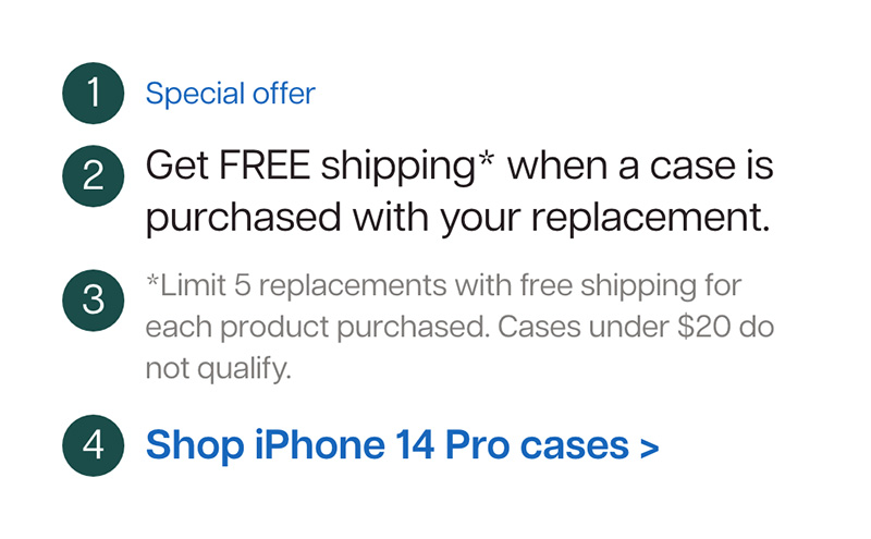
upsell rate
support requests
project summary
client need
BodyGuardz asked me to design a simplified interface that also allows for more complex upsell offerings.
before the project
- Interface is confusing and does not follow style guide
- High number of support calls related to interface
- Interface is not scalable, restricting upsell offers
what i did
- person_search User Research
- space_dashboard Wireframing
- web_traffic Prototyping
- family_history Flow Mapping
- lab_panel User Testing
the results of the project
- Interface follows style guide
- Decrease in customer support requests
- Increased trasnparency regarding shipping fees
- Scalable UI, alllowing for complex upsell offerings
- Interface educates users about potential upgrades

Meet Craig.
Meet Craig.
Craig had a bad day.
This morning, he had an important work meeting. He decided to pick up donuts on the way. He's nice like that. They were out of his favorite kind (maple bars).
On his way to work, his wife called him and told him he forgot to take a check she needed him to deposit at the bank today. He drove back home to get it.
Craig was late to his meeting. He filled his arms with his laptop bag, the box of donuts, and his phone on top.
As soon as he got to the meeting, his phone slid off the donut box and cascaded towards the floor. Ever have those moments when time slows down? SMACK!
Everyone watched in silence as Craig picked up his phone and saw a web of cracks sprawling across the screen.

"Oof, what a bummer," said his coworker, Carl. Craig didn't like Carl. "Also, you should have said you were bringing donuts! I already got everyone McMuffins."
Nobody ended up eating any donuts except for Carl.
At least Craig's screen protector came with a free replacement, right?
First, Craig dug through his emails to find the receipt for his screen protector. He couldn't remember the URL of the company.
Once he found it, he had to reset his password to log in. Eventually he found the company's replacements page.
He didn't want to upgrade to EyeGuard (whatever that is) or buy a new phone case, he just wanted his free replacement.
No matter what option he chose, he was being charged some amount. He called customer service and waited on hold to be told shipping was not included.
By the time Craig placed his replacement order, he realized the bank was about to close, so he rushed out the door. He didn't make it on time.
This case study is about me making Craig's day a little bit smoother.
Part 1
understanding the problems
section summary
- I developed an understanding of how the interface ended up this way
- I studied the problems with the existing interface
- I specified the primary objectives of the project
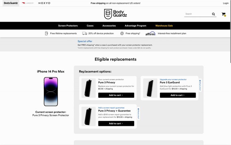
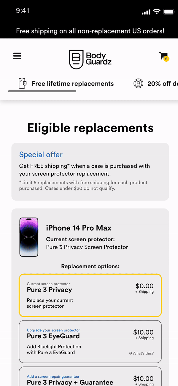
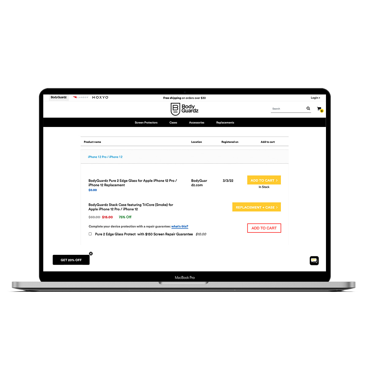
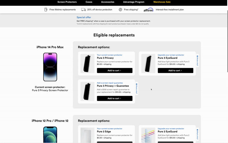
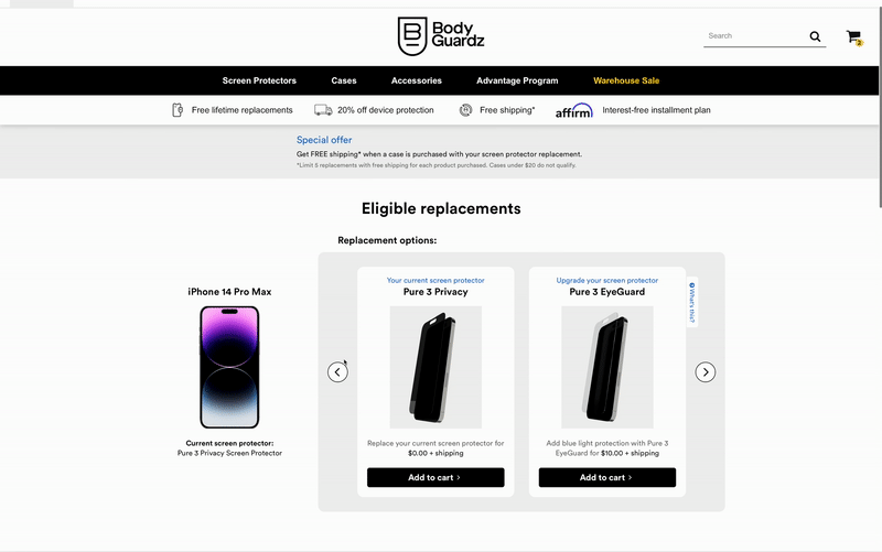
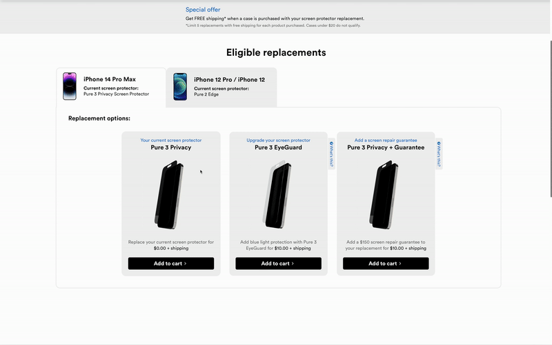
Originally, the interface offered a single button to add a replacement to your cart:
It wasn't pretty, but it worked.
When BodyGuardz started offering discounted upgrades and bundles for replacement orders, things started getting complicated:
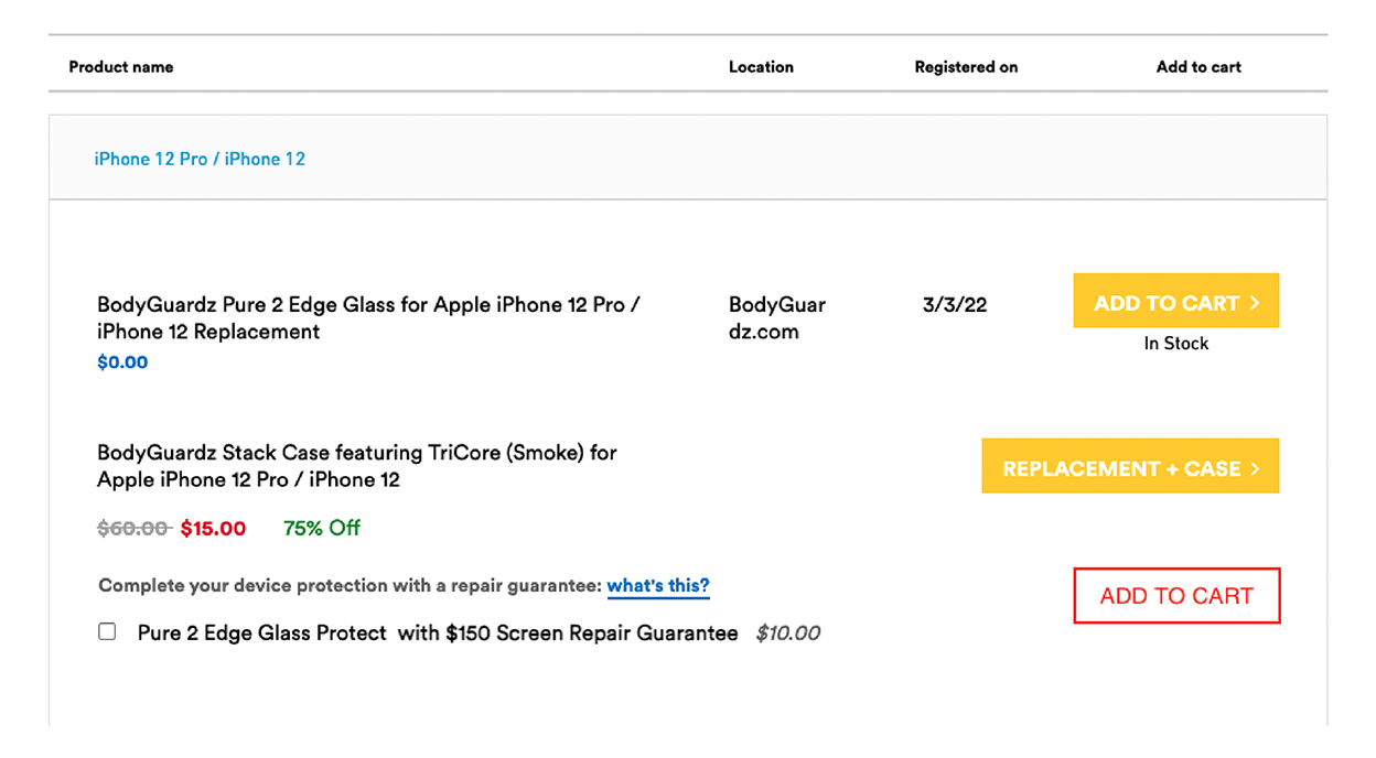
If you wanted to add a screen repair guarantee to your replacement product, what would you do?
- Check the box beside the guarantee and click the red add to cart button
- Check the box beside the guarantee and click both add to cart buttons
- Ignore the box and just click the red add to cart button
- None of the above
The answer:
I have no idea. I never found out.
No wonder Craig got frustrated.
In addition to the confusing functionality, there are a lot of inconsistencies with this design:
missing or irrelevant info
- Shipping fees not mentioned
- Poorly explained offers
- Lack of case choice in bundle
- Registration date irrelevant
- Registration location irrelevant
missing or irrelevant info
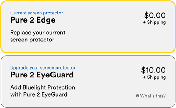
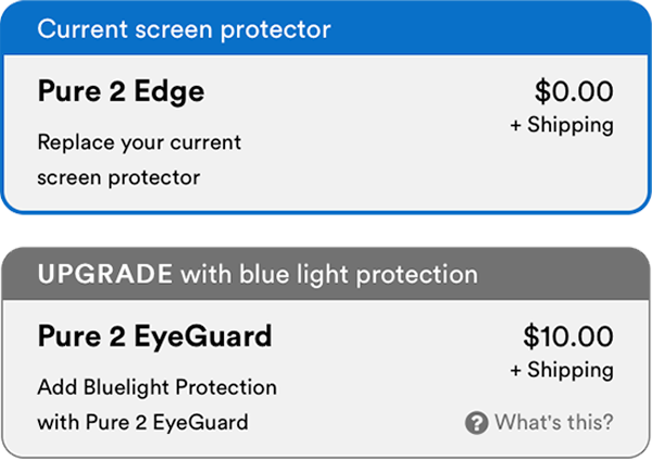
The black, white, yellow, and dark blue are the only colors on the style guide.
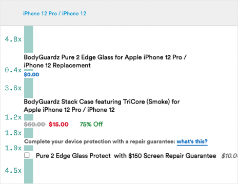
inconsistent styles
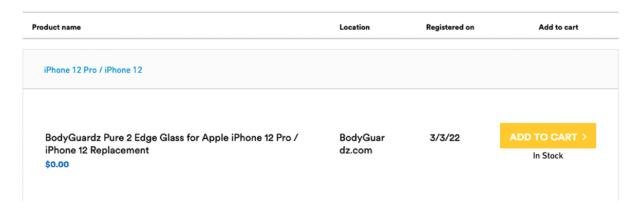
- iPhone 12 Pro
- BodyGuardz Pure 2 Edge Glass
- $0.00
- $60.00
- $15.00
- 75% Off
- Complete your device protection
- what’s this?
- $10.00
the future of the interface
At the end of the project, the stakeholders wanted:
Clear visuals that follow company branding
Simple functionality that is easy-to-use
Scalability in upgrades and bundles
Part 2
doing the research
section summary
- I created a user persona and story
- I mapped the emotional journey of the persona
Using some existing data provided by the product manager, I whipped together a simple persona and user story specifically for this project:
User Persona
Craig
summary
"I just want my free replacement."
age
48
gender
Male
device
iPhone 12 Max
career
Acct. Manager
User Story
Craig
As a busy office worker that relies on his phone
I want to quickly replace my phone's screen protector
so that I can get back to work without interruptions.
For this project, I tried something new. I created a hybrid of an empathy map and a user journey:
User Emotional Rollercoaster
Craig
event
emotion
Cracking his screen protector
frustration
Remembering he has a free replacement
relief
Encountering the replacement interface
confusion
Not knowing how to proceed
helplessness
Reaching out to support for help
impatience
Discovering an unexpected shipping fee
frustration
Receiving the free replacement
disgruntled relief
With a more mindful perspective of the user experience, I was ready to dive into the creation phase of the project and focus on keeping user emotions steady and positive rather than erratic and negative.
Retrospective thought:
The emotion rollercoaster exercise was actually really fun and I would like to use it more often. It focused less on the marketing aspect of a persona and more on their actual experience.
Part 3
the design process
section summary
- I broke up the interface into essential elements
- I created a flow detailing the functionality
- I worked with stakeholders to simplify the design
all the small things
I started by breaking up all of the elements that would need to be included in the final interface:
Interface Elements
current device elements:
- Device photo
- Device type
- Registered product
product offer elements:
- Offer type
- Product name
- Product description
- Price + shipping
- Learn more
bundle offer elements:
- Offer type
- Offer description
- Offer details
- Link to shop
orinoco flow
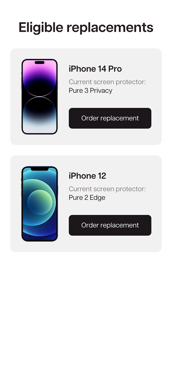
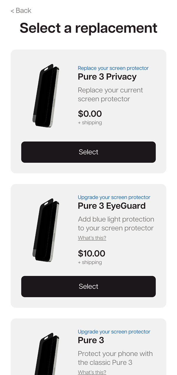
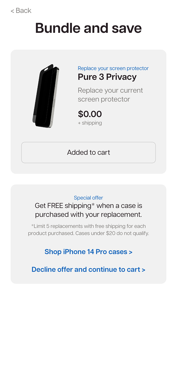
After breaking up the interface into its visual elements, I broke it up by its functions and user actions in a flow:
User Flow
Action Prompt:
Which product do you want to replace?
User Action:
User selects a device/product
Action Prompt:
Which product would you like to replace it with?
User Action:
User selects a replacement product
Replacement is added to cart
Is there a bundle offer available for this option?
Yes
Action Prompt:
Would you like to bundle your replacement with an additional product?
User Action:
User accepts or declines
No
Accept
Decline
Redirect to shop page for
compatible products
Redirect to Cart
will of the people
The first idea I came up with functioned like an old Windows installation wizard with a unique screen for each step of the flow. Here's that draft along with the feedback. I like to group feedback like this so its easier to digest:
First Prototype Draft
Step 1
Select a product
Step 1
Select a product
likes
- Simple and clean
- Clear grouping of information
- Allows for multiple products
- CTAs are straightforward
- Images make it look sleek and modern
- Follows style guide
concerns
- Most users will only have one product
- Possibly adds an unnecessary click
ideas
- Maybe combine with second page
Step 2
Select a replacement
Step 2
Select a replacement
likes
- Options are clearly labeled
- Descriptions on upgrades
- Allows for multiple offers
- Images to differentiate options
- Upfront about upcoming shipping fees
concerns
- Could result in a lot of scrolling
- Still feels a little overwhelming
- "What's this" may be hard to click
- Clicking button adds to cart?
ideas
- Work with copywriter for descriptions
- Separate the selection and confirm actions
Step 3
Add a bundle
Step 3
Add a bundle
likes
- Replacement added to cart easily
- Confirmation of selected replacement
- Offer information is clear and complete
- Link to shop for bundle-able products
concerns
- Not all products will have a bundle
- Title would be incorrect without bundle
- Cart link disappears without a bundle
ideas
- Separate the link to cart from bundle card
- Add a progress bar in earlier steps
The takeaway:
The multi-step, three page replacement process looks better, is easy to use, and scales well, but it feels like it takes longer to navigate. Finding a way to keep everything together on one page would be better.
kick, push
Feedback helped me identify a new limitation to the design to be considered: keep as much of the design as possible within one screen.
Before reaching the end of the project, I'd work through several iterations of the design elements. Here are a few examples:
Desktop Cards
We ended up scrapping these vertical cards and going with a horizontal card to decrease the total height of the content and allow users to view all of the options at once.
Mobile Cards
On mobile, we opted for a slightly different functionality that operates similar to radio buttons in a form. This prevents users from accidentally adding something to their cart that they didn’t want to.
Tooltip Dropdown and Drawer

We scrapped these ideas because they would be difficult to implement and use on the mobile version of the page.
Desktop Sliders
We scrapped this idea in favor of a layout where you could see all of the options at once.
Desktop Tabs
Because most users only have one device with a replaceable product, we opted not to move forward with this design.
Retrospective lesson:
I could have saved time by designing the mobile version of this first. The desktop design ended up being changed to adapt to mobile which in turn changed the desktop design.
Part 4
the results
section summary
- Design reduced total support requests by 8%
- Design increased upsell rate by 12%
Okay. Let's restart.
Meet Craig.
Meet Craig.
Craig's day is off to a bad start.
After a stressful morning, he dropped his phone and cracked its screen protector. Fortunately, it comes with a free screen replacement.
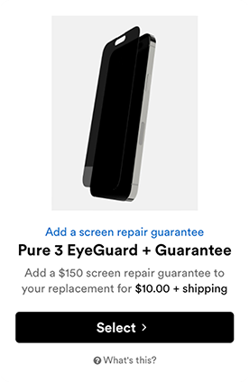
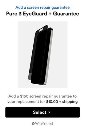
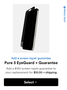
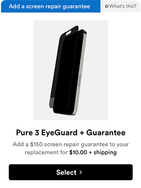
He learned about privacy screen protectors which darken the screen when you're not looking straight at it. It's perfect for privacy from nosy coworkers.
Craig's new screen protector is on the way. It made his day a little bit easier and only took minutes to get things back on track. Craig's a happy customer.
A smoother day for Craig has been the guiding goal.
Let’s take a look at the results:
upsell rate
support requests
the customer experience manager said:

the product manager said: