Integrated Engineering
email atomic design system.
client
Integrated Engineering (iE)
Creator of high-performance aftermarket mods for German-make cars including hardware upgrades and software tunes
handoff date
Oct 2023
Oct 2023
project type
Website Redesign
Website Redesign
status
Shipped
Shipped
role
Lead Product Designer
Lead Product Designer
rate will be updated once available.
design efficiency
rate will be updated once available.
unsubscribe rate
project summary
client need
A system to efficiently create emails that are useful, fun, and optimized for conversion.
before the project
- Default design templates that are not unique
- Design elements that do not follow company branding
- Content is impersonal, dense, and difficult to digest
what i did
- person_search User Research
- analytics Competitor Analysis
- atr Atomic Design System
- web_traffic Prototyping
the results of the project
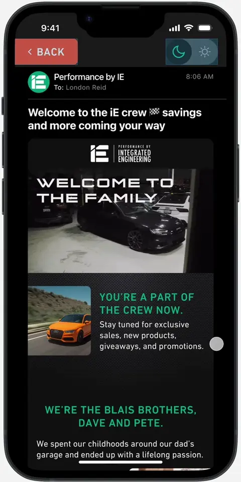
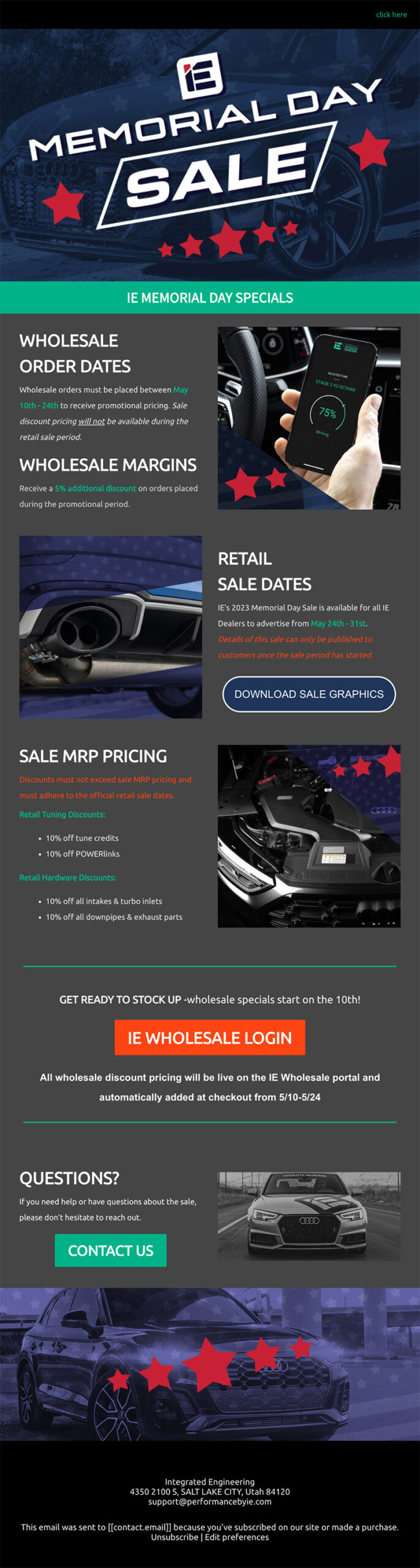
- 7 email templates, in light and dark color schemes, designed for desktop and mobile devices
- An atomic design system with atoms, molecules, and organisms to create new templates
- Documented standards for designing new components for email or other projects
- Fewer unsubscriptions
- Improved design efficiency
both users and the client loved the final design:
the graphic designer said:

the email marketing manager said:
the product manager said:
I never thought I had ADHD. I thought people with ADHD were bouncing off the walls with way too much energy. I was normal, like my friends and family.
Turns out my mom, brother, and every best friend I ever had all have ADHD—so my baseline for "normal" was very skewed. Joke's on me.
ADHD brains crave more constant stimulation than neurotypical brains. Now it makes sense why drawing during school helped me pay more attention.
I've always found ways to make monotonous tasks more interesting, whether it's by multitasking, setting up reward systems, or adding challenges.
This tendency has led to a lot of my success. When work is slow, I'll keep it interesting by challenging myself "how can I make my job easier later?"
Questions like this have led to me working with managers to reform, streamline, and document team processes time and time again.
One manager I previously worked with thought of me when her marketing team needed to revamp, omptimize, and standardize their email marketing system.
This case study is about systematically making other people's jobs easier (just because I think it's fun... and for the money).
Part 1
the prologue
section summary
- I created an email atomic design system once before
- My manager asked me to create another one for Integrated Engineering
- Our goals included design efficiency, subscriber loyalty, and branded designs
The first time I created an email design system, this is the process it replaced:
- Marketing team plans a campaign with email marketer
- Email marketer works with copywriter to create an email outline
- Email marketer sends the email outline to the design team'
- Email design task is sent to a random designer
- Designer follows email design specifications from a possibly outdated PDF
- Multiple back-and-forth revisions between copy, design, and development teams
- Design is (finally) approved, developed, and sent*
*Sometimes not all revisions can be made before email needs to be sent
Here's what some people had to say about the process:
a designer said:
the email marketer said:
the product manager said:
I didn't like the process either. Here are more reasons why:
- Copy is written without design in mind
- Limitations specific to email design are unclear
- Each designer working off a different, possibly outdated version of the style guide
- Every design starts from scratch
- Designs between designers are inconsistent (ex: different button styles every time)
- Handoff to development is unstandardized
- Development time is bloated by inconsistency in designs
Around this time, I discovered atomic design systems. Atomic design systems break up the design process into basic, reusable building blocks:
Atoms
The smallest type of component. If you can’t divide a component without it becoming useless, it’s an atom.
Molecules
Groups of atoms that work together to create a single component which has a single function.
Organisms
Groups of molecules that form complex components with more than one function.
Templates
A complete design in which the content can be rearranged or swapped out as needed.
I proposed an email-specific atomic design system to my manager. She loved the proposal and we ended up implementing the system. It achieved everything we hoped it would:
- Copy written with specific design components in mind
- Design limitations are clearly stated
- Style guide is singular, accessible to all, and kept up-to-date
- Every design starts with a base template
- Designs are extremely consistent
- Handoff process is standardized
- Once system components are developed, no developers necessary
As a result of this reform, email revenue increased by 18% year-over-year, and the process was simplified dramatically.
A while later...
My manager reached out to me and told me she was working with a new company called Integrated Engineering. She asked me to create another email design system for her new team. Here's how it went.
Defining the objectives
After discussing the desired outcomes of the project with the product manager, here are the primary objectives we penned for the project:
-
Efficiency
Fewer steps between planning and sending emails and less rework
-
Loyalty
Reduced unsubscribe rates by providing enjoyable and useful content
-
Style
Designs that reflect company branding, independent from default ecommerce platform designs
Part 2
doing the research
section summary
- I used research from another project
- We analyzed existing email designs
- We analyzed inspo email designs
Integrated Engineering has three target audiences:
newcomers
New car owners with no experience in mods
enthusiasts
Enthusiastic hobbyist with some experience
experts
Community leader with extensive experience
For more details on the personas, stories, empathy maps, and journeys for these users, check out my ecommerce site redesign case study.
Alongside the existing use research, I asked the Product Manager to discuss a few of the current email designs with me. Here's an example of an analysis we did together:
Email Analyisis (of an email before this project)
- Uses some brand colors
- A good effort
- Header empty except for mysterious link
- Logo style is not on-brand
- Banner under hero isn't useful
- Text content is difficult to digest
- Orange text difficult to read
- 3 distinct button styles
- 3 unique image styles (color, b&w, monochrome)
- Spelling and grammar typos
- Inconsistent use of colors
Next, we looked at a few emails we both liked from other companies. Here's an example of how we analyzed these designs:
Email Analyisis (for inspo)
- Logo in header
- Hero showcases product and sale
- Images are relative to surrounding text
- Text is limited to short blurbs
- All text is easy to read
- Button styles are consistent
- Image styles are consistent
- Clean, professional design
- Unclear where buttons link to
- Content is not very helpful
- Content feels impersonal
This, alongside the user research, gave me a better idea of the type of email Integrated Engineering could design to provide the best user experience.
Retrospective lesson learned:
Since this project, I've become a fan of limiting bodies of text to a certain number of lines. This soft limit is a great way to make things feel easy to digest. These emails could have benefited from that.
Part 3
the design process
section summary
- I worked from atoms to templates
- Drawings helped me capture ideas
- The system improved as I designed new email templates
defining the atoms
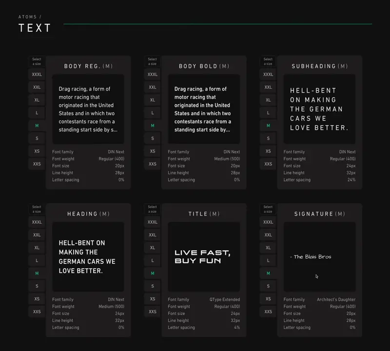
The first atoms I defined were basic styling standards. These included things such as brand colors, typefaces, links, and layouts.
This process involved a lot of back-and-forth between me, the product manager, and the brand manager:
london
product manager
london
product manager
london
brand manager
These conversations and a few tests helped us define the most basic elements that would make up every email design. I documented those definitions as atoms within the design system:
Text Atom
building the molecules
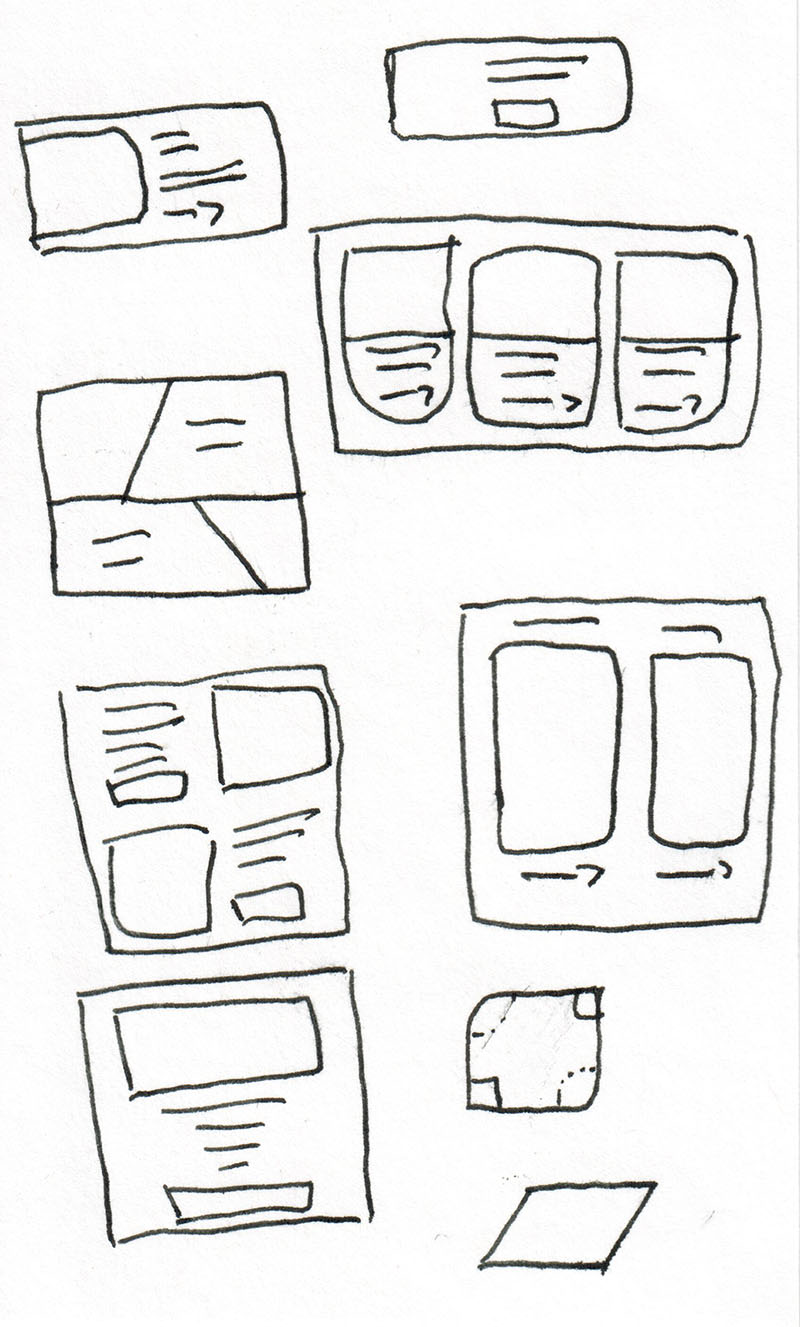
By combining a few atoms, molecules are made. To get speed up the ideation process, I browsed dozens of emails and drew sketches of molecule layouts inspired by those emails.
Molecule Sketches
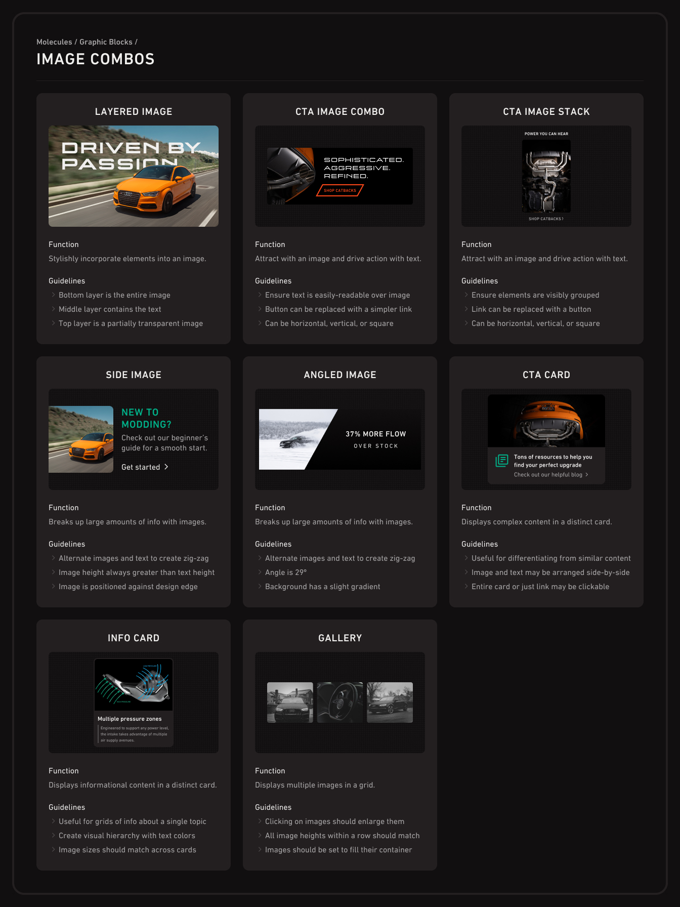
Next I developed those sketches into prototypes using the atoms I had already built in Figma. I also included documentation on the usage for each molecule:
Image Combo Molecules
creating the organisms
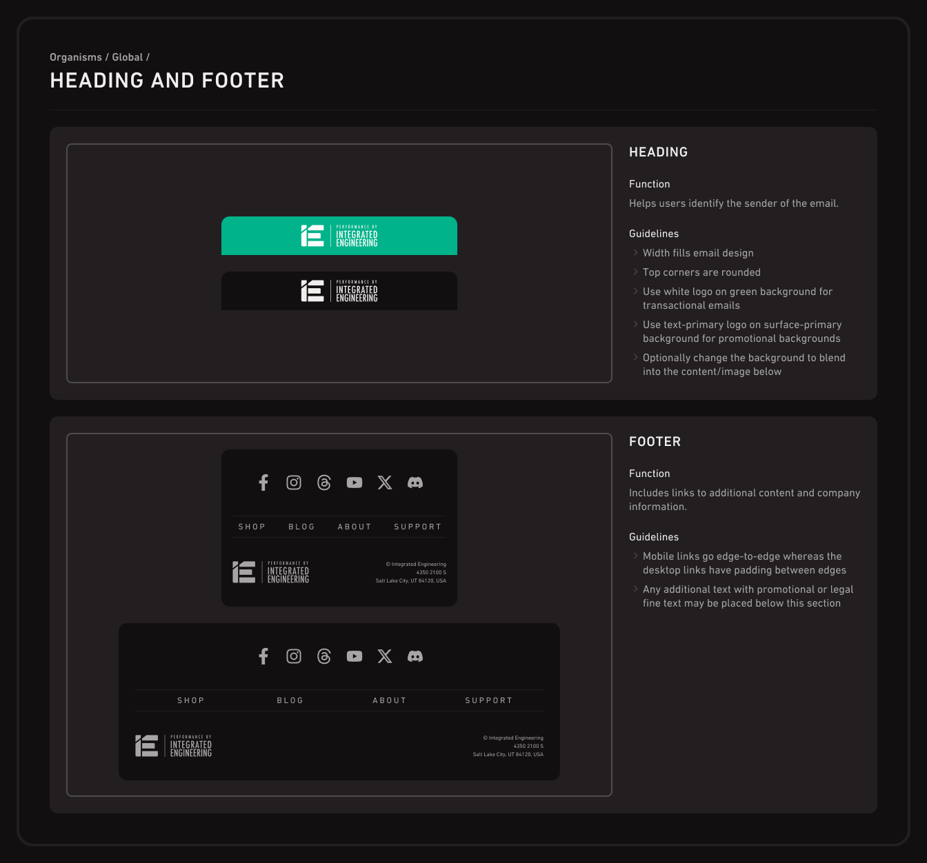
Any layouts that have more than a single function or combine molecules are defined as organisms:
Global Organisms
developing the templates
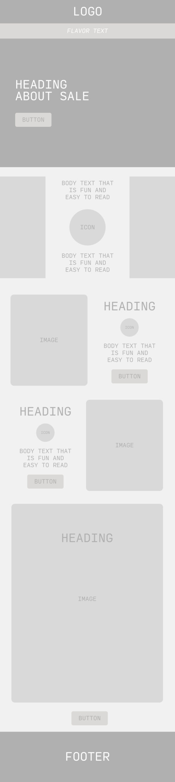
Once I had created a sizable set of atoms, molecules, and organisms, I started combining them to create full-page templates.
Whenever I needed a piece that hadn't been designed yet, I'd break it into its most basic elements and create the atoms, molecules, and/or organisms necessary. This helped fill out the library of components.
Part 4
the long-awaited results
section summary
- Some template designs are already in use
- Prototypes available for your perusal
Let’s take a look at the results:
design system
View on Figma keyboard_arrow_righttemplates
View on Figma keyboard_arrow_rightrate will be updated once available
design efficiency
rate will be updated once available
unsubscribe rate
Projects like this have a unique dynamic of having internal and external users. The system behind the email designs is for the team members who will be designing emails and the designs are for the subscribers.
Let's hear what the internal users have to say:
the graphic designer said:
the email marketing manager said:
the product manager said: